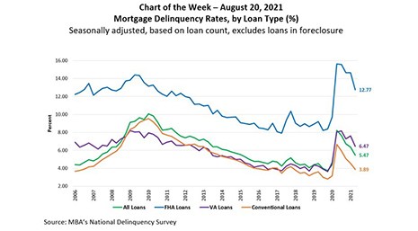
This week’s MBA Chart of the Week takes a look at mortgage delinquency rates by loan type (%) since 2006.
Tag: MBA Chart of the Week
MBA Chart of the Week Aug. 16 2021–Aggregate Back Rent Owed
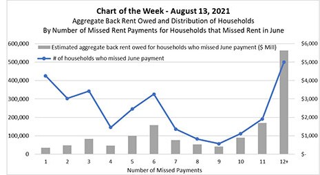
This week’s MBA Chart of the Week zeroes in on households who missed rental payments in June. The chart plots a) the distribution of those households by the number of payments they have missed since the onset of the pandemic; and b) an estimate of the aggregate dollar volume of back rent owed by those households.
MBA Chart of the Week Aug. 16 2021–Aggregate Back Rent Owed
This week’s MBA Chart of the Week zeroes in on households who missed rental payments in June. The chart plots a) the distribution of those households by the number of payments they have missed since the onset of the pandemic; and b) an estimate of the aggregate dollar volume of back rent owed by those households.
MBA Chart of the Week Aug. 9, 2021: Share of Monthly Forbearance Exits by Reason
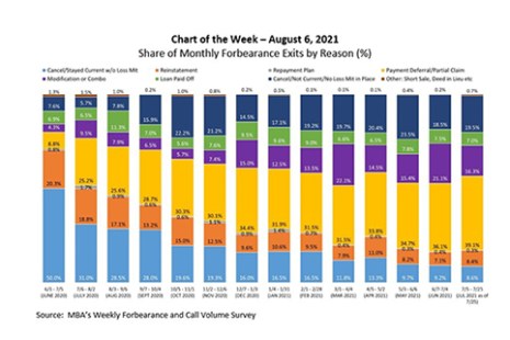
According to MBA’s Weekly Forbearance and Call Volume Survey, the share of loans in forbearance dropped to 3.47 percent of servicers’ portfolio volume as of July 25, 2021, from a peak of 8.55 percent as of June 7, 2020. While the number of borrowers exiting forbearance has fluctuated from one month to the next, with the largest number of reported exits in July and October of last year, the post-forbearance outcomes for borrowers have differed.
MBA Chart of the Week Aug. 9, 2021: Share of Monthly Forbearance Exits by Reason
According to MBA’s Weekly Forbearance and Call Volume Survey, the share of loans in forbearance dropped to 3.47 percent of servicers’ portfolio volume as of July 25, 2021, from a peak of 8.55 percent as of June 7, 2020. While the number of borrowers exiting forbearance has fluctuated from one month to the next, with the largest number of reported exits in July and October of last year, the post-forbearance outcomes for borrowers have differed.
MBA Chart of the Week Aug. 2, 2021: HMDA Respondents
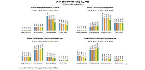
A total of 4,309 companies reported lending activity under the Home Mortgage Disclosure Act in 2020, according to MBA’s own analyses of the dataset.
MBA Chart of the Week Aug. 2, 2021: HMDA Respondents
A total of 4,309 companies reported lending activity under the Home Mortgage Disclosure Act in 2020, according to MBA’s own analyses of the dataset.
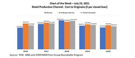
MBA Chart of the Week July 23 2021: Retail Production Channel Cost to Originate
In this week’s MBA Chart of the Week, we focus on the production costs in the retail channel. The cost to originate averaged $8,243 per loan in 2020, a $453 per loan improvement over 2019.
MBA Chart of the Week July 23 2021: Retail Production Channel Cost to Originate
In this week’s MBA Chart of the Week, we focus on the production costs in the retail channel. The cost to originate averaged $8,243 per loan in 2020, a $453 per loan improvement over 2019.
MBA Chart of the Week July 23 2021: Retail Production Channel Cost to Originate
In this week’s MBA Chart of the Week, we focus on the production costs in the retail channel. The cost to originate averaged $8,243 per loan in 2020, a $453 per loan improvement over 2019.