MBA Chart of the Week: 10-Year Treasuries and 30-Year Fixed Rates
In recent weeks, markets are increasingly predicting that inflation and real economic growth will pick up rapidly worldwide as the COVID-19 vaccine continues to be rolled out, and that the central banks are being are being too pessimistic in their views on monetary policy accommodation and may have to reverse course abruptly. This has caused sovereign bond yields globally to rise more quickly than anticipated, and we expect this volatility will persist until the path forward becomes clearer.
On the inflation front, recent data have indicated rising input costs to businesses, and these increased costs, in many cases, will be passed on to the consumer in the form of higher prices. This will especially be the case if we see greater demand for goods and services later this year.
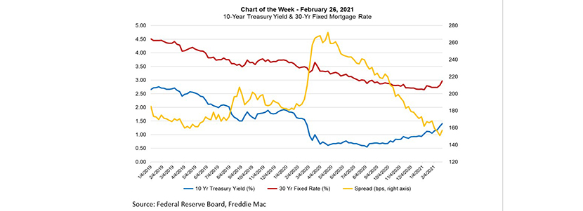
The U.S. 10-year Treasury yield ended last week at 1.34 percent, and spiked to 1.64 percent briefly Thursday before settling back in the 1.4 to 1.5 percent range when markets closed. The 10-year yield has increased a full percentage point from its low of 0.52 last year, but is back to approximately where it was a before the pandemic-induced recession.
This week’s chart shows the recent climb in rates, and the spread between the 30-year mortgage rate, as surveyed by Freddie Mac, and the 10-year Treasury yield. As the 10-year has risen, so has the 30-year fixed rate, which has gone up 24 basis points since the beginning of February. Mortgage-to-Treasury spreads blew out to over 260 basis points during the recession because of industry capacity challenges and financial market volatility. They have narrowed to about 160 basis points in recent weeks, which is tighter than the historical average of about 180 basis points.
Note also that the Freddie Mac survey only reflects mortgage rates for purchase loans. The adverse market fee on refinance originations imposed by the FHFA likely adds 10-15 bps to mortgage rates, which is likely being passed through to the borrower. Thus, the spread shown in the chart is somewhat wider for refinance loans.
–Mike Fratantoni mfratantoni@mba.org; Joel Kan jkan@mba.org.