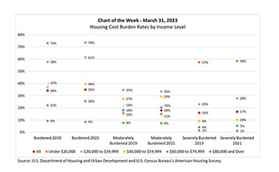
In this week’s MBA Chart of the Week, we look at housing cost ratios by household income level, using data from the 2021 American Housing Survey.
Tag: Edward Seiler
MBA: February Mortgage Application Payments Up 5%
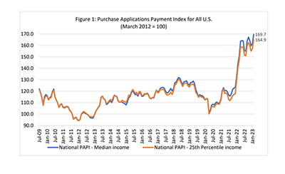
Homebuyer affordability declined in February, with the national median payment applied for by purchase applicants increasing 4.9 percent to $2,061 from $1,964 in January, according to the Mortgage Bankers Association’s monthly Purchase Applications Payment Index.
MBA: February Mortgage Application Payments Up 5%
Homebuyer affordability declined in February, with the national median payment applied for by purchase applicants increasing 4.9 percent to $2,061 from $1,964 in January, according to the Mortgage Bankers Association’s monthly Purchase Applications Payment Index.

RIHA Releases Second Collection of Essays on Climate Change’s Impact on Real Estate Finance
The Mortgage Bankers Association’s Research Institute for Housing America published a second collection of essays that addresses affects of climate change on the real estate finance industry.
RIHA Releases Second Collection of Essays on Climate Change’s Impact on Real Estate Finance
The Mortgage Bankers Association’s Research Institute for Housing America published a second collection of essays that addresses affects of climate change on the real estate finance industry.
RIHA Releases Second Collection of Essays on Climate Change’s Impact on Real Estate Finance
The Mortgage Bankers Association’s Research Institute for Housing America published a second collection of essays that addresses affects of climate change on the real estate finance industry.
MBA: Mortgage Application Payments Increased 2.3% in January to $1,964
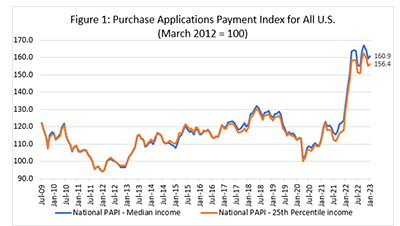
Homebuyer affordability declined in January, with the national median payment applied for by purchase applicants increasing 2.3 percent to $1,964 from $1,920 in December 2022, the Mortgage Bankers Association reported.
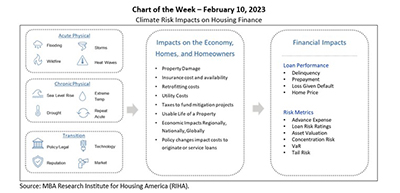
MBA Chart of the Week Feb. 10 2023: Climate Risk and Housing Finance
The Research Institute for Housing America, MBA’s think tank, released the first volume of A Collection of Essays on Climate Risk and the Housing Market that examines various aspects of how climate risk is impacting housing markets (as summarized in this week’s chart that replicates Exhibit 1 from the second essay).

RIHA Releases Collection of Essays on Impact of Climate Change on Real Estate Finance
The Mortgage Bankers Association’s Research Institute for Housing America published a new collection of essays addressing the impacts of climate change on the real estate finance industry.