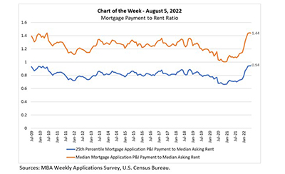
This MBA Chart of the Week examines the relationship between mortgage payments and asking rents since the second half of 2009. MBA’s national mortgage payment to rent ratio compares the national median and 25th percentile mortgage payments to the national median asking rent.
Tag: Edward Seiler
MBA: Mortgage Application Payments Hold Steady Despite Higher Rates
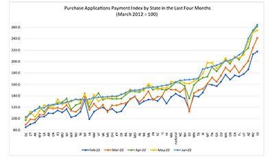
Homebuyer affordability was mostly unchanged in June, with the national median payment applied for by applicants down slightly to $1,893 from $1,897 in May, the Mortgage Bankers Association’s Purchase Applications Payment Index reported.

Who Owns Climate Risk? MBA White Paper Examines Challenges, Risks for U.S. Real Estate
The Mortgage Bankers Association this week issued a white paper examining how climate change is dramatically reshaping lenders’ and policymakers’ approaches to the U.S. real estate market.
Who Owns Climate Risk? MBA White Paper Examines Challenges, Risks for U.S. Real Estate
The Mortgage Bankers Association this week issued a white paper examining how climate change is dramatically reshaping lenders’ and policymakers’ approaches to the U.S. real estate market.
Who Owns Climate Risk? MBA White Paper Examines Challenges, Risks for U.S. Real Estate
The Mortgage Bankers Association this week issued a white paper examining how climate change is dramatically reshaping lenders’ and policymakers’ approaches to the U.S. real estate market.

RIHA: Boomer Homeowners’ Mortality Expected to Have Minimal Impact on Housing Supply, Prices
More than 4 million existing-homes for sale annually over the next decade will come from the aging and mortality of older homeowners, but sustained homebuyer demand from population growth and younger-generation households should lead to minimal excess housing supply and have no measurable reduction in home prices.
MBA RIHA: Baby Boomer Homeowners’ Mortality Expected to Have Minimal Impact on Housing Supply and Prices
More than 4 million existing-homes for sale annually over the next decade will come from the aging and mortality of older homeowners, but sustained homebuyer demand from population growth and younger-generation households should lead to minimal excess housing supply and have no measurable reduction in home prices.
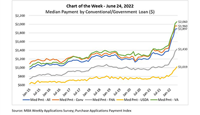
MBA Chart of the Week June 24, 2022: Median Payment by Conventional/Government Loan
The national median mortgage payment was $1,897 in May, a slight increase from $1,889 in April and $572 higher than in May 2021, according to this week’s Purchase Applications Payment Index release.
May Mortgage Application Payments Rise to $1,897
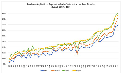
Homebuyer affordability was largely unchanged in May, with the national median payment applied for by applicants up slightly to $1,897 from $1,889 in April, according to the Mortgage Bankers Association’s monthly Purchase Applications Payment Index.
May Mortgage Application Payments Rise to $1,897
Homebuyer affordability was largely unchanged in May, with the national median payment applied for by applicants up slightly to $1,897 from $1,889 in April, according to the Mortgage Bankers Association’s monthly Purchase Applications Payment Index.