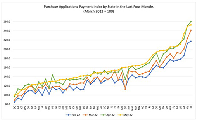
Homebuyer affordability was largely unchanged in May, with the national median payment applied for by applicants up slightly to $1,897 from $1,889 in April, according to the Mortgage Bankers Association’s monthly Purchase Applications Payment Index.
Tag: Edward Seiler
MBA Chart of Week June 3, 2022: MBA Purchase Applications Payment Index
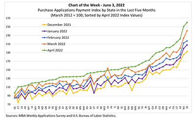
In March, MBA released its inaugural monthly Purchase Applications Payment Index (PAPI) – an affordability index that measures how new fixed-rate 30-year purchase mortgage payments vary across time relative to income. The third PAPI release on May 26 – based on April MBA Weekly Applications Survey data – gives us a picture of how affordability has been affected by increasing interest rates and elevated loan application amounts in the first third of 2022.
MBA Chart of Week June 3, 2022: MBA Purchase Applications Payment Index
In March, MBA released its inaugural monthly Purchase Applications Payment Index (PAPI) – an affordability index that measures how new fixed-rate 30-year purchase mortgage payments vary across time relative to income. The third PAPI release on May 26 – based on April MBA Weekly Applications Survey data – gives us a picture of how affordability has been affected by increasing interest rates and elevated loan application amounts in the first third of 2022.
MBA: April Mortgage Application Payments Jump 8.8% to $1,889
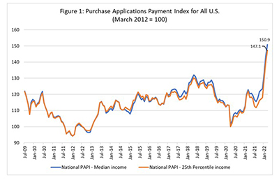
Homebuyer affordability decreased in April, with the national median payment applied for by applicants rising by 8.8 percent to $1,889 from $1,736 in March, the Mortgage Bankers Association reported Thursday.
MBA: April Mortgage Application Payments Jump 8.8% to $1,889
Homebuyer affordability decreased in April, with the national median payment applied for by applicants rising by 8.8 percent to $1,889 from $1,736 in March, the Mortgage Bankers Association reported Thursday.
MBA: March Median Mortgage Application Payment Jumps 5% to $1,736
Homebuyer affordability declined in March, with the national median payment applied for by applicants rising 5 percent to $1,736 from $1,653 in February, the Mortgage Bankers Association reported Thursday.
MBA: March Median Mortgage Application Payment Jumps 5% to $1,736
Homebuyer affordability declined in March, with the national median payment applied for by applicants rising 5 percent to $1,736 from $1,653 in February, the Mortgage Bankers Association reported Thursday.
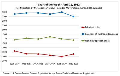
MBA Chart of the Week Apr. 15, 2022: Net Migration by Metropolitan Status
MBA Chart of the Week shows net migration by metropolitan status from spring 2015 to spring 2021. The most recent 2020-2021 data allows us to examine moves during the first year of the pandemic, and to see if, as widely reported, there was accelerated movement out of cities to the suburbs (or even further afield) compared to the five years prior to COVID-19.
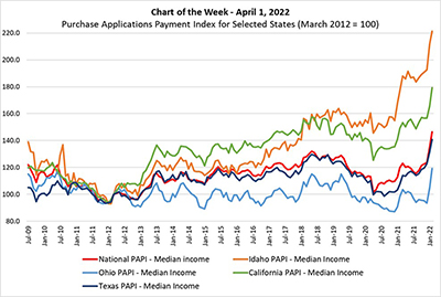
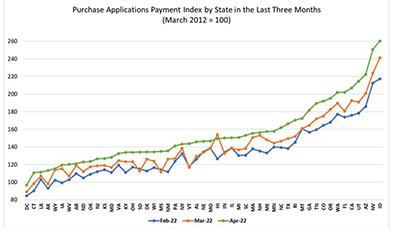
MBA Chart of the Week Apr. 1 2022: MBA Purchase Applications Payment Index
On March 24, MBA released its inaugural, monthly Purchase Applications Payment Index (PAPI) – an affordability index that measures how new fixed-rate 30-year purchase mortgage payments vary across time relative to income.