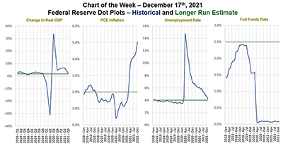
This week’s MBA Chart of the Week traces the Federal Open Market Committee forecasts and long-run estimates of four key metrics that contribute to Fed decision-making and communication – GDP, inflation, unemployment and the Fed funds rate.
Tag: Edward Seiler
MBA Chart of the Week: Payment & Employment Characteristics
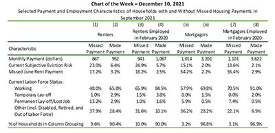
This week’s MBA Chart of the Week zeroes in on selected payment and employment characteristics of households who made and missed their rent and mortgage payments in September.
MBA Chart of the Week: Payment & Employment Characteristics
This week’s MBA Chart of the Week zeroes in on selected payment and employment characteristics of households who made and missed their rent and mortgage payments in September.
RIHA: More Renters, Fewer Homeowners Missed Housing Payments in September, October
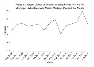
Renters were three times more likely than homeowners to miss payments during September and October, according to updated research released Tuesday by the Mortgage Bankers Association’s Research Institute for Housing America.
RIHA: More Renters, Fewer Homeowners Missed Housing Payments in September, October
Renters were three times more likely than homeowners to miss payments during September and October, according to updated research released Tuesday by the Mortgage Bankers Association’s Research Institute for Housing America.
MBA Chart of the Week, Dec. 3, 2021: U.S. Household Wealth
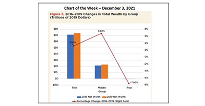
This week’s MBA Chart of the Week shows that the net wealth of the rich, the top 10% of households, increased by 3.2% between 2016 and 2019, while the net worth of the poor, the bottom 30% of households, decreased by 7.6%.
MBA Chart of the Week, Dec. 3, 2021: U.S. Household Wealth
This week’s MBA Chart of the Week shows that the net wealth of the rich, the top 10% of households, increased by 3.2% between 2016 and 2019, while the net worth of the poor, the bottom 30% of households, decreased by 7.6%.
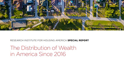
RIHA Study: U.S. Household Net Worth Up 17.6% Between 2016-2019
The median net worth of U.S. households increased from $103,000 in 2016 to $127,000 in 2019 – a gain of 17.6% and the highest amount since 2007, according to The Distribution of Wealth in America Since 2016, a new report released Thursday by the Mortgage Bankers Association’s Research Institute for Housing America.
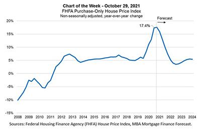
MBA Chart of the Week: FHFA Purchase-Only Price Index
This week’s MBA Chart of the Week shows FHFA’s quarterly, non-seasonally adjusted year-over-year HPA starting from the fourth quarter of 2008 through the second quarter of 2021, together with MBA’s quarterly forecast through the end of 2024.