In March, MBA released its inaugural monthly Purchase Applications Payment Index (PAPI) – an affordability index that measures how new fixed-rate 30-year purchase mortgage payments vary across time relative to income. The third PAPI release on May 26 – based on April MBA Weekly Applications Survey data – gives us a picture of how affordability has been affected by increasing interest rates and elevated loan application amounts in the first third of 2022.
Tag: MBA Chart of the Week
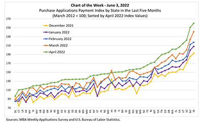
MBA Chart of Week June 3, 2022: MBA Purchase Applications Payment Index
In March, MBA released its inaugural monthly Purchase Applications Payment Index (PAPI) – an affordability index that measures how new fixed-rate 30-year purchase mortgage payments vary across time relative to income. The third PAPI release on May 26 – based on April MBA Weekly Applications Survey data – gives us a picture of how affordability has been affected by increasing interest rates and elevated loan application amounts in the first third of 2022.
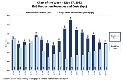
MBA Chart of the Week May 27, 2022: IMB Production Revenues and Costs
MBA last week released its latest Quarterly Performance Report for the first quarter. In this week’s Chart of the Week, we show production revenues compared to production expenses from first quarter 2018 to first quarter 2022.
MBA Chart of the Week May 27, 2022: IMB Production Revenues and Costs
MBA last week released its latest Quarterly Performance Report for the first quarter. In this week’s Chart of the Week, we show production revenues compared to production expenses from first quarter 2018 to first quarter 2022.
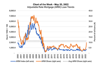
MBA Chart of the Week May 20, 2022: ARM Loan Trends
The recent increase in the adjustable-rate mortgage share of applications has caught the attention of market participants and the media. The ARM share has increased from 3.1 percent in the first week of January to 10.3 percent as of the week ending May 13, peaking at 10.8 percent the week prior.
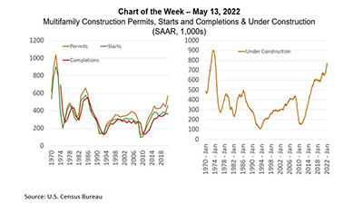
MBA Chart of the Week May 13, 2022: Multifamily Construction
Housing markets are tight. Multifamily developers are responding. Developers are currently building 800,000 new homes in buildings with 5 or more units – the most since the mid-1970s – and will put-in-place a record $100 billion of multifamily housing construction this year.
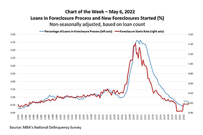
MBA Chart of the Week May 9, 2022: Loans in Foreclosure Process
The Mortgage Bankers Association’s National Delinquency Survey covers national and state delinquencies through the first quarter of 2022.
MBA Chart of the Week May 9, 2022: Loans in Foreclosure Process
The Mortgage Bankers Association’s National Delinquency Survey covers national and state delinquencies through the first quarter of 2022.