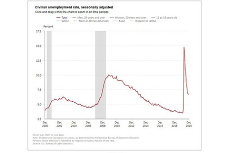
Employers added an impressive 379,000 jobs last month, the Bureau of Labor Statistics reported Friday, welcome news for an economy still struggling with the loss of millions of jobs resulting from the coronavirus pandemic.
Tag: Bureau of Labor Statistics
January Employment Picture Brightens a Little
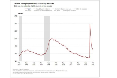
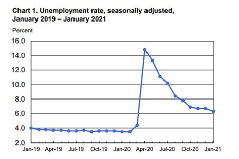
Employers added 49,000 jobs in January, the Bureau of Labor Statistics reported Friday. And while the unemployment rate fell from 6.7% to 6.3%, Americans are still dealing with nearly 10 million jobs fewer than a year ago as a result of the coronavirus pandemic.
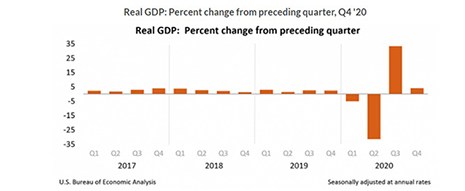
4th Quarter GDP Slows after Explosive 3Q Rebound
Gross domestic product increased at an annual rate of 4 percent in the fourth quarter, according to the “advance” estimate released yesterday by the Bureau of Economic Analysis.
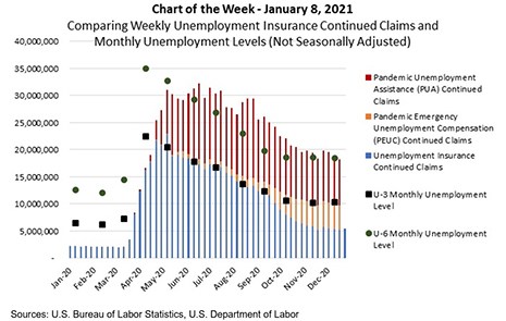
MBA Chart of the Week: Unemployment Insurance Continued Claims
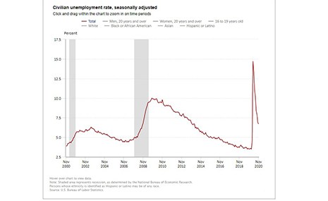
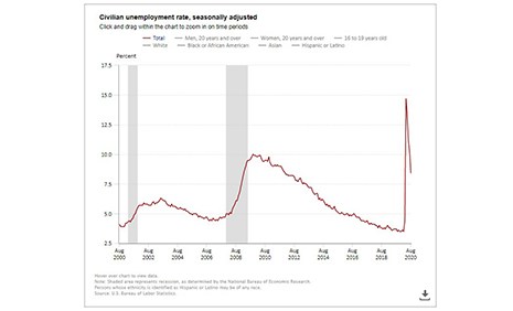
The COVID-19 pandemic continued to impact the labor market to close 2020. Friday’s release from the Bureau of Labor Statistics showed that faster layoffs led to a loss of 140,000 jobs in December and kept the headline unemployment rate (U-3) at 6.7 percent.
Job Losses Mark December Employment Report
The U.S. economy shed 140,000 jobs in December, the Bureau of Labor Statistics reported Friday, although the unemployment rate held steady at 6.7 percent.
Job Growth Slows Heading into Uncertain Winter
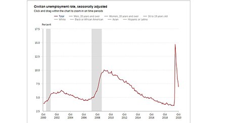
Total nonfarm payroll employment growth slowed to 245,000 in November, the Bureau of Labor Statistics reported Friday, with nearly 10 million fewer jobs currently compared to a year ago.
Employers Add 638,000 Jobs; Unemployment Remains Elevated
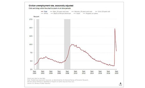
The economy continued its high-low pattern in Friday’s employment report from the Bureau of Labor Statistics. While total nonfarm payroll employment rose by a strong 638,000 in October, and the unemployment rate fell to 6.9 percent, both numbers reflect the devastating economic effects of the coronavirus pandemic.
September Jobs Report Shows Continued Economic Churn
The final national jobs report before the November elections showed a slowing pace of job creation amid continued economic volatility, the Bureau of Labor Statistics said Friday.
Employment Report: Progress, ‘But a Long Way to Go’
Total nonfarm payroll employment rose by 1.4 million in August, while the unemployment rate fell to 8.4 percent, the U.S. Bureau of Labor Statistics reported Friday.
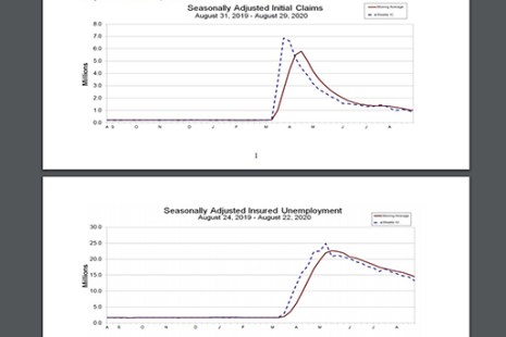
Unemployment Claims Fall Back Under 1 Million—With an Asterisk
Initial claims for unemployment fell under one million last week for just the second time since March, but the change largely reflected a change in methodology by the Labor Department and remain elevated by historical standards.