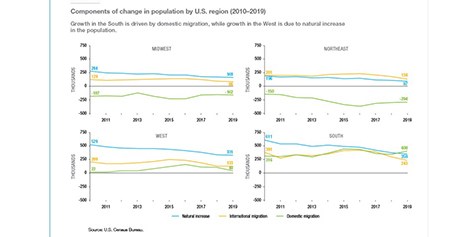
Freddie Mac, McLean, Va., reported the U.S. population in the South and West grew seven times faster than in the Northeast and Midwest between 2017 and 2019.
Tag: Population Changes
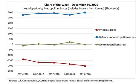
MBA Chart of the Week: Net Migration by Metropolitan Status
This week’s MBA Chart of the Week shows net migration by metropolitan status over the past five years. The green line shows that the net movement into nonmetropolitan areas has hovered around zero, growing by an average of 19,000 migrants (nationally). On the other hand, metropolitan areas absorbed more than 5.7 million migrants over this period.
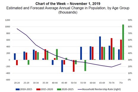
MBA Chart of the Week: Changes in Population By Age Group
Housing demand in the U.S. is expected to grow considerably over the next decade, as the large Baby Boomer cohort grows into age groups formerly held by the Silent Generation, and Millennials mature into age ranges formerly populated by the smaller Generation X. In each of the past two years, these trends have helped add a net 1.6 million households.